This is a feature on my blog where I select art from my body of work and share my thoughts and opinions about it. Of course, I am interested in what you think of the chosen work. Remember to give me your feedback in the comment section down below.
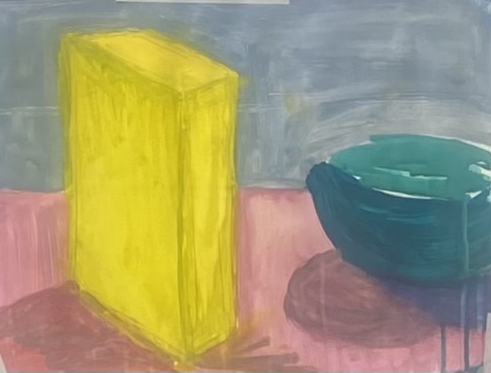
I have chosen the above painting because it always puts a smile on on my face every time I look at it. The painting is a study of colour theory using acrylics.
In this work, warm and cool colours interact with each other. The warm pink of the table cover contrasts well with the greenish blue colour of the bowl. The cool greens and blues recede into the background while the warm pinks draw you close to the surface.
Space and depth are depicted in the painting by deep pink / mauve tones. To finish, I find the bright yellow hues of the cardboard box adds just the right amount energy to the painting.

Leave a comment